
When I joined, Ripple’s UI was fragmented across three core products, taxing engineering velocity. I architected and led the company’s first design system to resolve this inconsistency, achieving 100% adoption and 92% UI consistency. While initially built to unify our native products, the system’s robust token architecture evolved into a strategic M&A integration engine — slashing rebrand timelines for the acquired Custody product by 75% and establishing the scalable foundation now critical for integrating Ripple’s 2025 acquisition cohort.
A scalable design system by defining token foundations, core component libraries, structured intake processes, plan, design, review, and cross-team release workflows to ensure quality, adoption, and long-term operational health.
Executive sponsorship and VP-level OKRs through data-driven audits, stakeholder roadshows, and phased rollout strategies, establishing the design system as a core pillar of Ripple’s product velocity and M&A scaling initiatives.
Hands-on collaboration across visual design, engineering, and brand teams to codify Ripple’s first accessibility-compliant, multi-mode (light/dark) component set, adopted by five product lines and operationalized through Figma, Storybook, and Zeroheight.
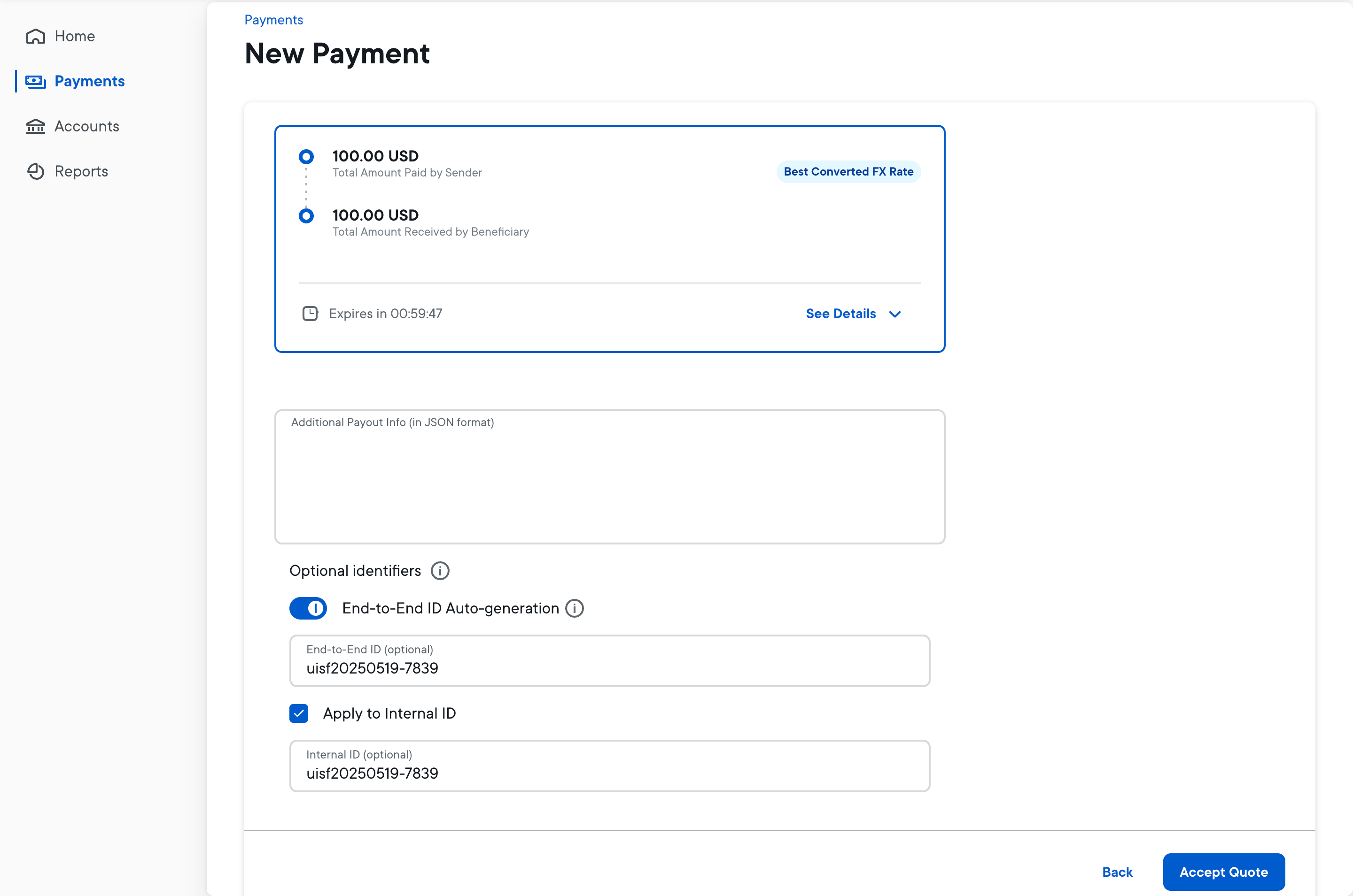
Enter password to view full case study
Access to the full design process is restricted to comply with NDA requirements. Please email contact@bryanshi.com to request an access key.
Tallying 12 button styles exposed Ripple’s silent tax on velocity.
When I joined Ripple in 2020, there was no centralized design system. A UI audit across the company’s three core products uncovered alarming fragmentation—12 different button styles, uncoordinated layouts, and scattered brand interpretations. Engineering teams burned time on rework, design drift was common, and engineers frequently rebuilt the same components from scratch.
Design fragmentation wasn’t cosmetic — it silently taxed velocity across every team.
The impact was measurable: it often took a full quarter for a feature to travel from design to code because every team first had to patch mismatched UI foundations.
To surface the issue, I launched a weekly audit report—each week focusing on a single component (e.g., buttons, form fields, tables). Every report compiled annotated screenshots of that component across products, highlighted inconsistencies, and estimated the engineering hours lost to re-implementation. Weekly audit snapshots made it undeniable: UI inconsistency wasn’t cosmetic — it was an operational bottleneck throttling product velocity.
:: Sample audit report—Week 01 “Buttons” with annotated screenshots and time-loss estimate.
Monthly road-shows won headcount, budget, and VP-level OKRs for a system push.
Armed with audit data, I launched monthly design reviews across product design, visual design, and engineering. These weren’t passive showcases — they were working sessions where stakeholders logged real-world friction caused by lack of a system.
By positioning the design system as a lever for velocity and cross-team consistency — not just a visual polish project — I secured executive buy-in. My pitch: a shared system could enable 75% faster rebrands (critical for consistent acquisitions), UX consistency, and a clear design foundation for launching new products.
Result: formal support from VP Design and VP Engineering, headcount for 1 dedicated designers, and 3 engineers to kickstart the initiative.
:: Quote card from VP Engineering: “Finally one design language to unite us all.”
Colors, type, iconography, motion curves distilled into 140 design tokens.
Our first priority was to distill Ripple’s brand into a modular, platform-agnostic design vocabulary ready for cross-product scaling. Partnering with visual design and engineering, we introduced a token system that captures every foundational element.
Tokens decouple brand from code, allowing us to unify complex infrastructure without a single refactor.
- Typography: deployed TT Ripple, a custom font built to display extensive fiat and crypto-currency symbols and data states cleanly at any size.
- Color: an accessibility-first palette mapped 1-to-1 to light and dark-mode tokens.
- Iconography: harmonised story, illustrative, and functional icon sets into a single variable-sized library.
- Motion: shared timing curves applied consistently across product, marketing web, and video.
These components were codified into 140 design tokens, enabling engineers to apply brand-consistent styles with a single reference and switch themes (including dark mode) by updating token values, not code.
:: Token Matrix – Ripple Design Tokens Mapped Across Platforms (Frontify + Figma Snapshot)
Plan → Design → Implement flow cut rework efforts by 40%.
With UI fragmentation clear, scaling a design system demanded more than better components — it needed an engineered, predictable delivery process spanning teams and products. I experimented and designed a phased workflow that combined structure, flexibility, and cross-team alignment from the start.
Intake and Prioritization
I established a Jira-backed intake portal to collect new system needs — whether for components, token extensions, or updates. Requests were triaged through weekly grooming sessions, where we prioritized the backlog based on business impact, product coverage, and engineering feasibility, ensuring that we focused efforts where they mattered most.
Scoping and Strategy Alignment
Each prioritized request moved into a standardized scoping phase. Using a Confluence spec template, we captured clear definitions, intended use cases, design strategy considerations, token mappings, and engineering complexity. Early cross-functional reviews aligned design, engineering, and product stakeholders before any design work began — reducing late-stage rework and ambiguity.
Design and Review
Components were designed using real product screens to ensure practical fit and stress-tested across edge cases. We introduced a bi-weekly design review rhythm, using a formal checklist that validated token usage, variant structure, accessibility standards, and developer handoff readiness. This eliminated many of the common gaps between design and build phases.
Delivery and Release
Finalized components were published to Figma libraries, paired with live Storybook demos, and documented through Zeroheight — integrating design, code, and usage guidance into seamless releases. We announced new components via weekly release notes, highlighted quarterly progress in newsletters, and supported adoption through dedicated Slack channels for ad-hoc guidance and issue resolution.
Through this workflow, we shipped the first batch of 10 foundational components — including buttons, form fields, tables, and navigation patterns — with consistent quality and predictable timelines. Compared to the previous ad-hoc approach, the systemized process reduced rework efforts by over 40% and significantly accelerated product delivery across teams.
:: Swim-lane workflow diagram showing intake to release phases. Weekly announcements, quarterly newsletters, Slack support.
Strategic phased rollout ensured smooth adoption across Ripple’s expanding product ecosystem.
With system foundations secured, we shifted to a phased rollout strategy — turning adoption into a repeatable, scalable playbook across Ripple’s growing ecosystem. Rolling out the design system wasn’t just a matter of dropping new libraries into products — it was a carefully staged, cross-team effort designed to minimize disruption and maximize adoption.
We prioritized adoption phase-by-phase — building playbooks, not just shipping libraries.
We prioritized the rollout in phases, starting with Ripple’s flagship Payments platform. By migrating Payments first, we were able to uncover, document, and resolve technical challenges early — setting patterns, best practices, and migration toolkits that could be reused across future rollouts.
Once Payments established a stable foundation, we expanded adoption to other Ripple-native products like Stablecoin and Compliance, ensuring that new initiatives launched with system-first implementations from day one.
The final and most complex phase involved rebranding Custody, an acquired product with its own pre-existing UI stack. By leveraging the system’s flexible token architecture and reusable components, we completed the Custody rebrand within nine months — achieving full brand alignment without requiring a full redesign from scratch.
Behind the scenes, we built a scalable developer pipeline where design tokens were automatically compiled into npm packages — including forms, icons, theming, core UI components, and collection utilities — significantly reducing developer lift and ensuring fidelity between design and production. Every new component or update went through our four-layer release review (Content, Attribute, Anatomy, Behavior), which became the QA north star for validating consistency across teams and platforms.
The Custody rebrand was more than just a UI update — it was a strategic stress test for the system. By leveraging the system’s platform-agnostic tokens, we completed the integration within nine months, validating that our architecture could ingest an external tech stack and align it with Ripple’s standards efficiently. This success serves as the proof-of-concept for our 2026 strategy, providing a tested blueprint to onboard the newly acquired wallet infrastructure, prime brokerage, and treasury management platforms.
:: Custody Rebrand Before/After
Treating designers and engineers as customers drove full adoption across Ripple’s ecosystem.
Scaling the system meant treating Ripple’s designers and engineers as primary customers — embedding tools into daily workflows, building habits, and earning trust. From the start, we treated Ripple’s designers and engineers as our primary “customers,” designing the system rollout to fit into their daily tools and rhythms.
To keep momentum high, we launched an internal newsletter announcing new component releases and best practices. We created a Storybook sandbox where designers and engineers could explore components hands-on, test variants, and view real code examples without barriers. A dedicated Slack bot made it easy to surface usage snippets, token references, and documentation directly inside conversations, minimizing friction. To further unblock adoption, we hosted weekly office hours where teams could bring real-world design and engineering questions and get immediate support.
The results validated the approach. By Q3 2024, we achieved 100% design system adoption across all five major product lines. Designers inserted system components over 12,000 times per month in Figma libraries, making the system an integral part of day-to-day workflows. UI support tickets dropped to 38% reduction year-over-year — indicating not just higher adoption, but fewer implementation gaps and smoother product development.
True adoption wasn’t forced — it was engineered by making it easier to use the system correctly than to work around it.
:: Radial Chart – Adoption Growth, Component Usage, Ticket Reduction Metrics.
Early alignment saved countless cycles as Ripple scaled.
Building Ripple’s first company-wide design system surfaced foundational lessons — not just about UI governance, but about treating systems as evolving products tied to business outcomes.
The most critical shift was treating the system as a product, not a project — constantly aligning priorities and scope with business impact, not just visual polish. Our token-first strategy thrived, enabling faster scaling into dark mode and product theming with minimal rework.
At the same time, we learned that small components demanded the most governance. For example, icons — often overlooked — required rigorous structure and documentation to prevent drift across marketing, web, and product environments.
When we skipped formal scoping on large components like Navigation Bars early on, it cost weeks of rework — a clear reminder that Scope Docs were not optional, even for “simple” asks.
Finally, splitting libraries between marketing and product teams created branching complexity we hadn’t fully anticipated. Investing early in Figma infrastructure, versioning, and ops tooling became critical to long-term system health.
Armed with these lessons, we set our sights on evolving Ripple’s design system into a multi-layered foundation — one that could not only scale but inspire future products.
:: Lessons Learned Sticky Notes – Top 5 Unexpected System Building Insights.
The Ecosystem Operating System
With the integration of virtual accounts, wallet infrastructure, prime brokerage, and treasury capabilities into our core platform, the Design System faces a new mandate: evolving from a visual library into the architectural backbone of the One Ripple ecosystem.
To support the 2026 Unified UX strategy, we are expanding the system’s scope to enforce structural governance:
Unified Information Architecture
Moving beyond UI components to standardize the fundamental logic of the ecosystem. We are codifying core object definitions — harmonizing conflicting models of accounts, balances, and transactions across payments, custody, and treasury workflows to ensure a seamless view of financial health.
Context-Aware Navigation Shell
Introducing a dynamic navigation framework that adapts based on the hierarchical relationship between identity, entity organization, and user permissions. This responsive shell allows the system to dynamically render features — like Collection, Payout, or Wallet Management — based on specific entitlements, enabling a unified Operator Command Center without the friction of disparate portals.